Case study 03 · Toyota · The Friedkin Group
Accident Reporting
Reporting a collision is the worst possible moment to meet a bad form. The journey was rebuilt from incident to resolution.
Friedkin Fleet · Sign-in · Desktop
Fig. 01

Role
Design lead — service mapping, IA, wireframes, UI
Timeline
6 months, phased release
Team
Designer, claims SMEs, PM, mobile and web engineers
Platform
Driver mobile · coordinator and manager desktop
The problem
Designed for the adjuster, used by the driver.
The existing intake asked for everything the claims file would eventually need, in the order the file needed it. The person filling it in was standing at the roadside, shaken, one-handed, on poor signal, often at night.
After submission, silence. The most common follow-up contact was not a question about the claim. It was "did you get it?"
Discovery
Mapping the whole journey.
We mapped four stages against what a person can realistically do at each, and what the business genuinely needs from them at that moment. Almost every field in the original form was in the wrong stage.
Stage 01
At the scene
Safety first, capture second. Photos, location and a timestamp. Nothing typed that can be inferred.
Stage 02
Report
Guided narrative in plain language. Resumable, and saved locally the moment signal drops.
Stage 03
Handoff
Explicit confirmation, a reference number, and who will call — with a window, not a promise.
Stage 04
Resolution
Persistent status the driver can check without calling. Every state change is a notification.
Architecture
Five surfaces, one case record
Three audiences touch one incident: the driver at the scene, the coordinator who triages it, the manager who reads the pattern afterwards. Getting the sitemap right meant deciding which of them owns each field.
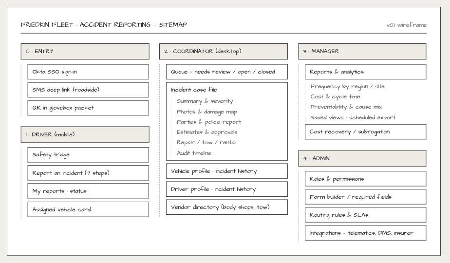
Sitemap · v0.1
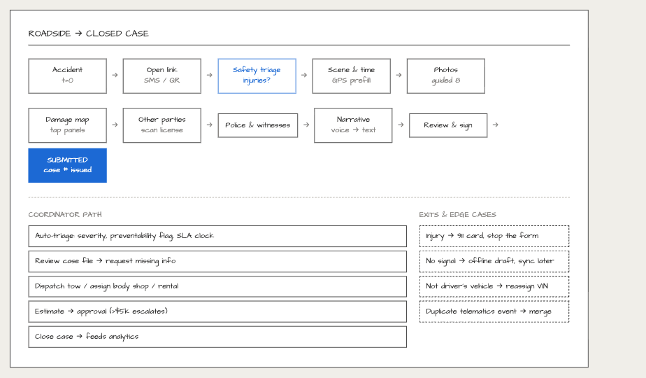
Roadside → closed case · with exits and edge cases
Wireframes
Every surface, settled before any visual work
Grey-box wireframes went in front of drivers and coordinators first. Arguing about field order is cheap here and expensive once a screen looks finished.
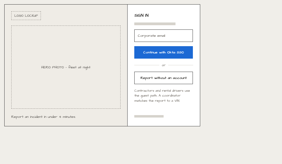
Entry · SSO and guest path
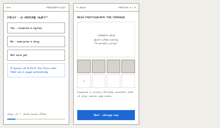
Driver · Triage and photos
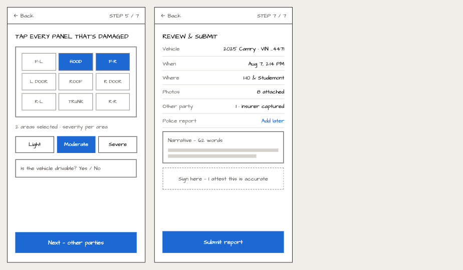
Driver · Damage map and review
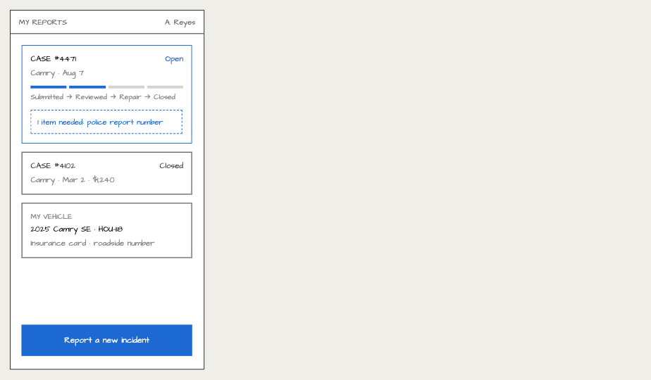
Driver · Status after submission
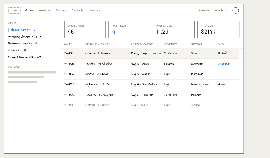
Coordinator · Queue
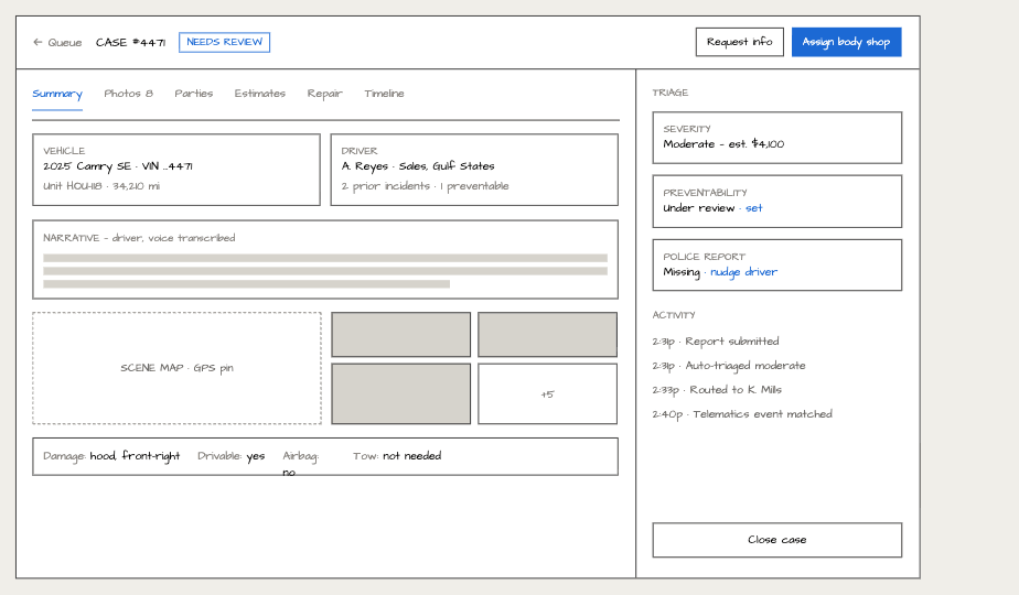
Coordinator · Case file
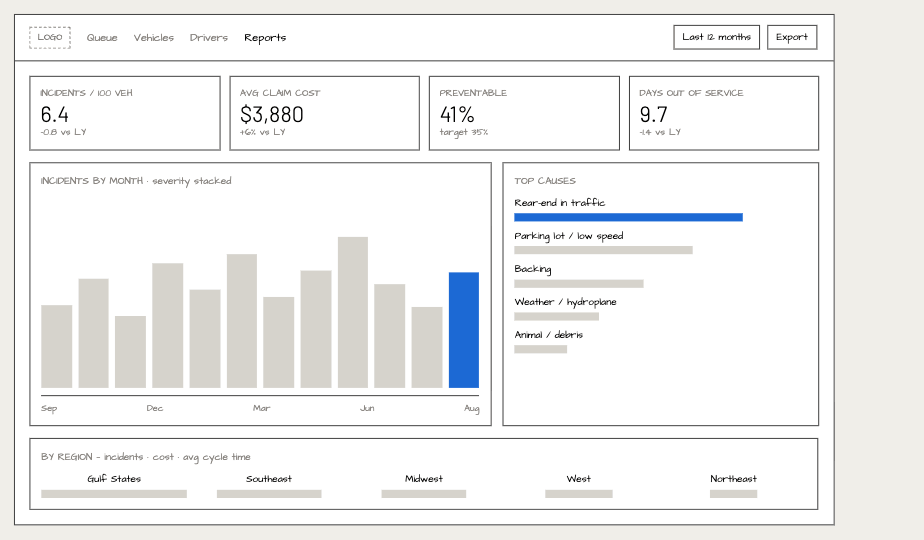
Manager · Reports
Design decisions
Fewer decisions at the roadside.
One task per screen
One thing to settle at a time, grouped by what the driver can see in front of them. Large targets, high contrast, readable in a car at night with one hand.
Guided photo capture
Prompted angles replaced a free-form upload, so adjusters stopped chasing missing evidence later.
Nothing is lost
Every answer persists locally and syncs when signal returns. The report can be finished hours later.
Deferred detail
Policy and billing fields moved out of intake entirely. They are collected once the driver is safe.
The driver flow
Seven steps, one task per screen. Tested unmoderated with drivers in simulated conditions — dim lighting, gloves, interruptions.
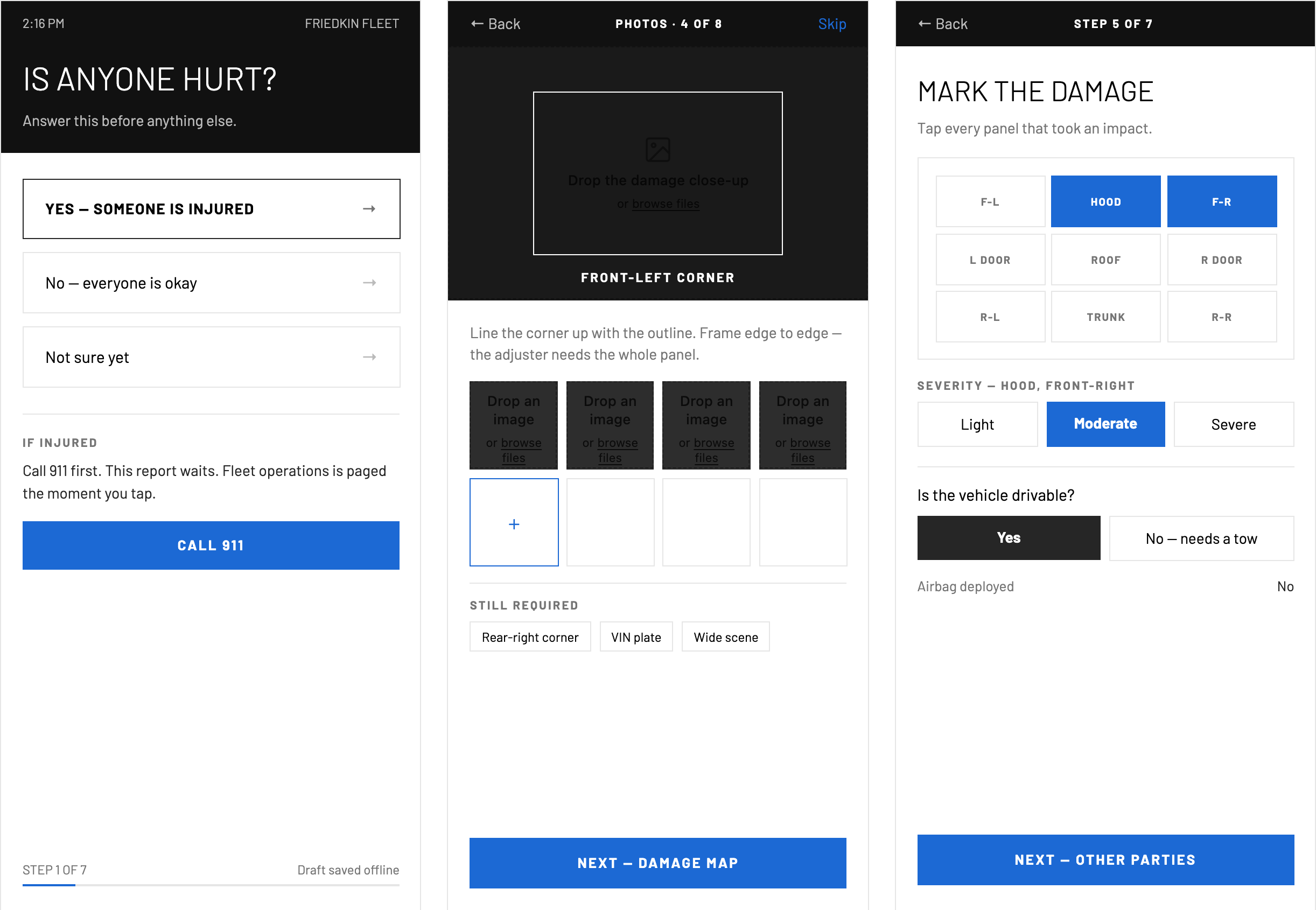
Steps 1, 4, 5 · Safety triage · Guided photos · Damage map
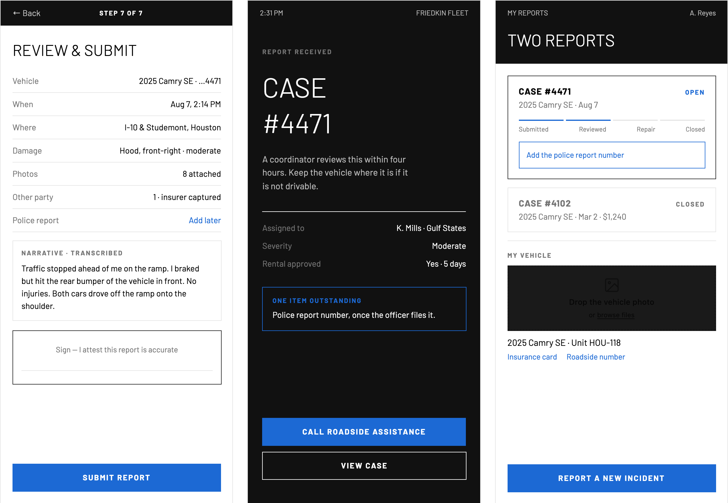
Steps 7, then after · Review and sign · Case received · My reports
Safety is step one and it is a full screen. Answering "yes" stops the form and pages fleet operations — the report can wait.
Photo capture is prompted, not free-form. A ghost outline names the shot, and the still-required list stays visible so nothing is missed at the scene.
The narrative is spoken and transcribed. Typing a paragraph at the roadside is the single most abandoned step in the old form.
The other half of the service
Coordinator desktop.
A shorter roadside form only works if the back office can still do its job. Everything removed from the driver was either inferred, deferred, or moved here — where the person has two screens, a keyboard and no adrenaline.
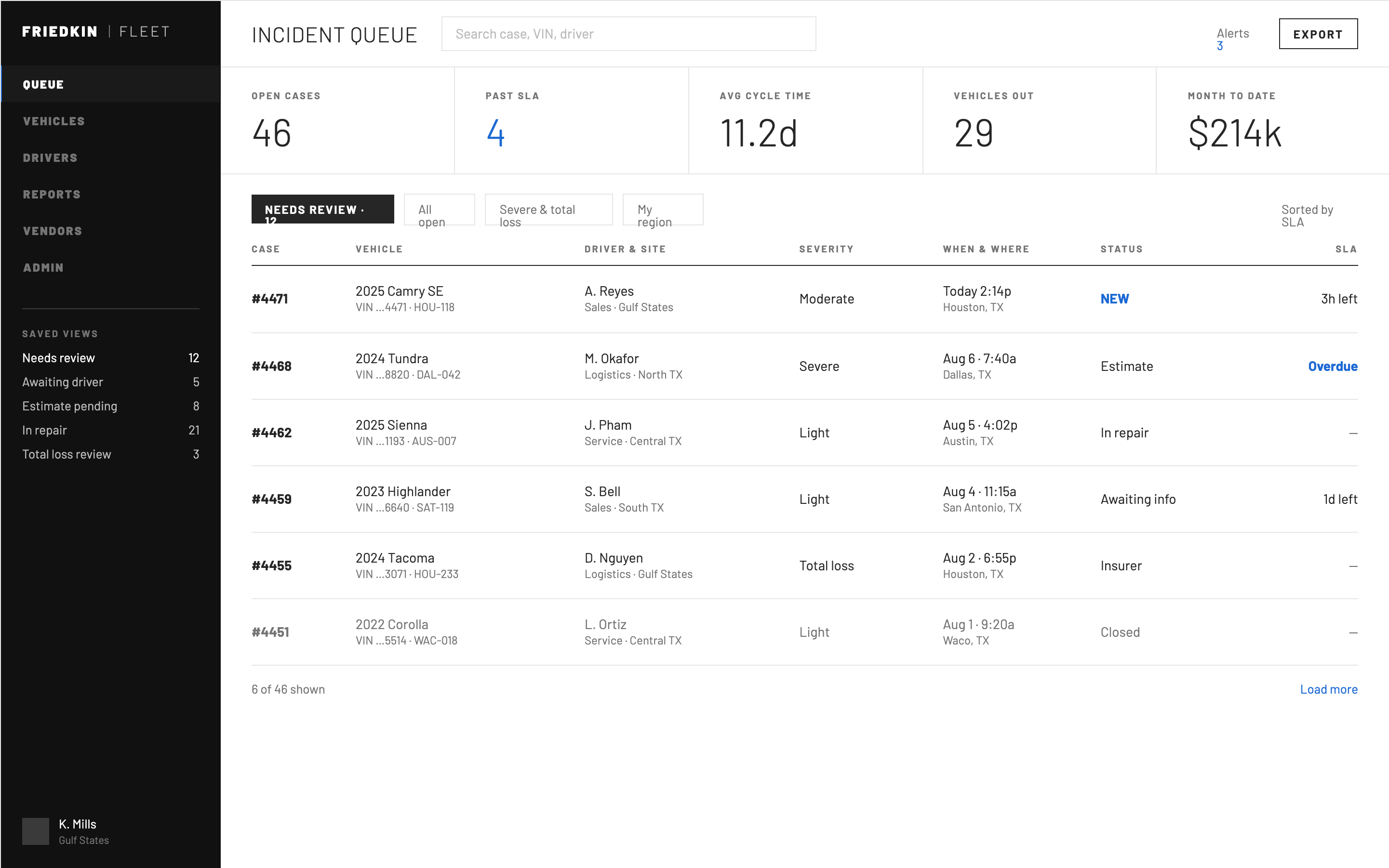
Queue · Sorted by SLA, not by date
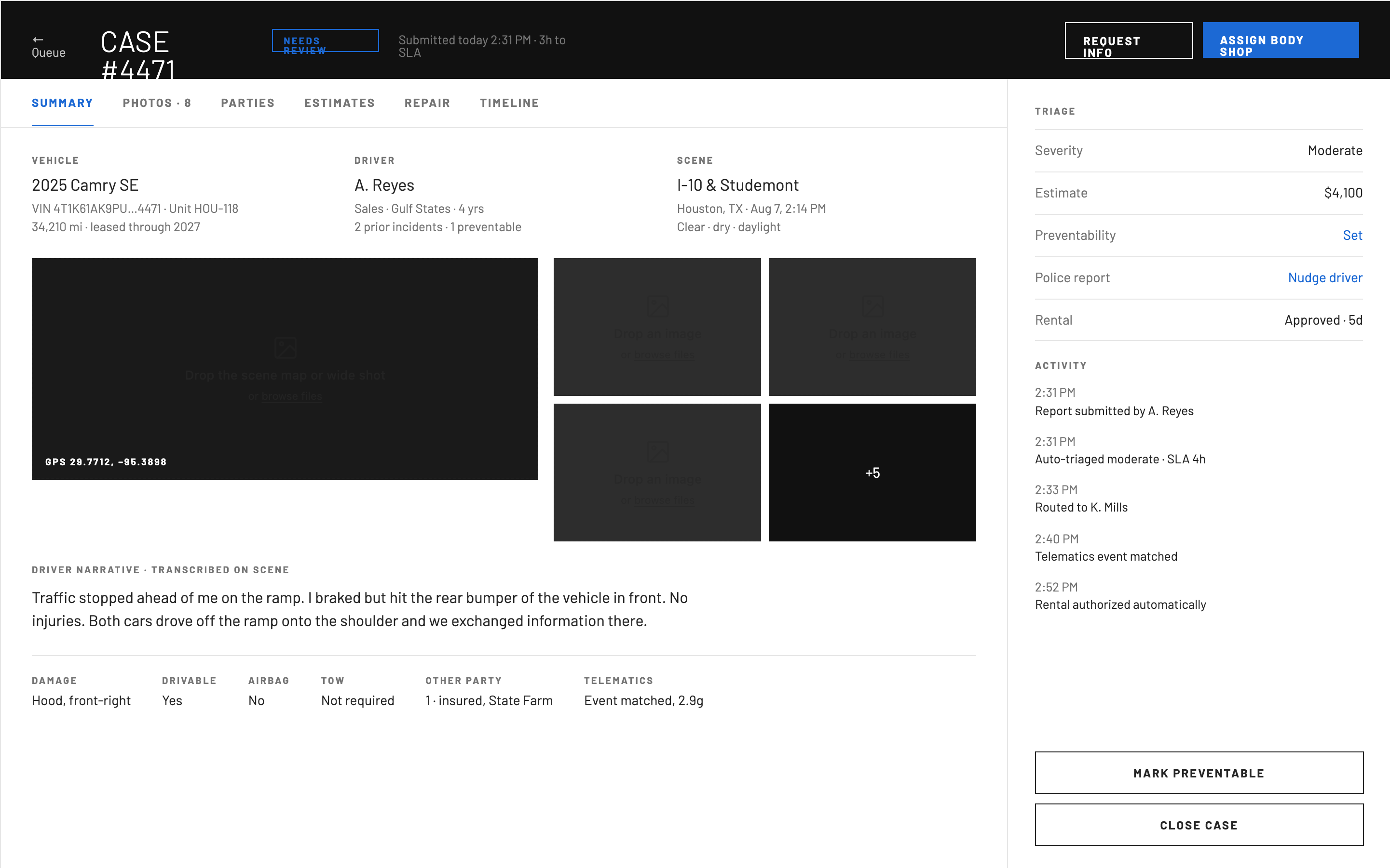
Case file · Everything the driver sent, plus what the system inferred
Auto-triage sets severity and starts an SLA clock on submission, so the queue orders itself by what is about to breach.
Missing items are a nudge to the driver, not a blocked case. The police report number arrives days later and the file knows that.
Every automated decision is written to the activity log. Regulated work needs to show who — or what — changed the record.
What the data is for
Manager · Fleet safety scorecard
Structured intake is what makes the pattern legible. Because severity, cause and preventability are captured as fields rather than prose, closing a case feeds the scorecard automatically — no one re-keys anything.
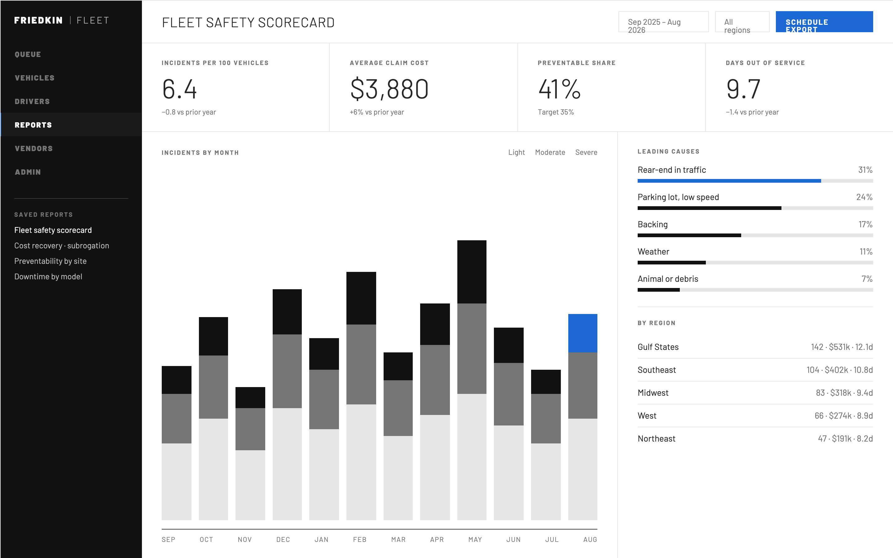
Twelve months · Severity-stacked, cause-ranked, region-split
Outcomes
A shorter worst day.
Fewer roadside fields
Intake reduced to what a person at the scene can actually answer; the rest deferred or inferred.
Complete evidence
Guided capture cut the back-and-forth for missing photos and details after submission.
"Did you get it?" answered
Explicit confirmation and persistent status removed the most common reason to call.
Post-launch completion and call-volume figures are held by the client. Available on request in interview.
Reflection
High-stakes design is mostly subtraction. Every field we removed from the roadside was a negotiation with someone whose reporting depended on it, and the argument that worked was never "it's simpler" — it was showing the abandoned reports that field caused.
The status screen was scoped as a nice-to-have. It turned out to be the part of the service people talked about.
Back to case study 01
Financial Wellness Zone