Case study 01 · USAA Bank
Financial Wellness Zone
Members had a dozen ways to check their money and no way to make a plan. We unified fragmented tools into one personalized planning experience.
Role
Design lead — research, IA, interaction
Timeline
9 months, three releases
Team
2 designers, 1 researcher, PM, 6 engineers
Platform
Responsive web, native app parity
The problem
Twelve tools, no plan.
Retirement calculators, budget trackers, insurance needs estimators and debt payoff tools had each shipped separately, owned by separate lines of business. Members could answer twelve narrow questions and still not know whether they were on track.
Support transcripts showed the real ask underneath: not "calculate this" but "tell me what to do next." Nothing in the product answered that.
Discovery
18 member interviews
Across three life stages — early career, mid-career with dependents, pre-retirement — to find where confidence broke down.
Evidence
Tool-level analytics
Entry points, abandonment and repeat use across all existing calculators. Most sessions touched exactly one tool, once.
Alignment
Stakeholder mapping
Four business owners, four roadmaps. Naming that conflict early made the shared IA a negotiation, not a surprise.
What members said
"I can see all my numbers. I still don't know if I'm doing okay."
Member, mid-career · Interview 07
Strategy
One place, one question.
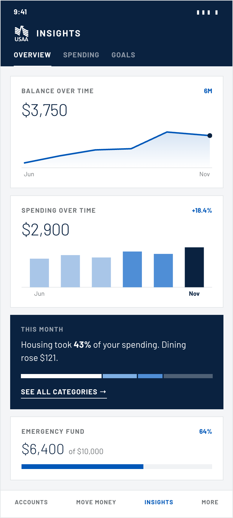
We reframed the product from a toolbox to a plan. One hub answers "am I on track" in four cards a member can read at a glance, and every existing calculator becomes a task inside a tab rather than a destination of its own. Three principles governed every decision after that.
Status before tools
The first thing on screen is where you stand, not what you can click.
One next action
Every screen recommends exactly one thing. Ranked by impact, never by business unit.
Progress is visible
Finishing a task changes what the cards say next month. The loop has to close, or nobody returns.
Information architecture
Twelve destinations collapsed to one hub
Before
12 destinationsUSAA Home
Twelve siblings, four owners, no relationship between them. Every one asked the member to start over.
After
One hub, three tabsUSAA Home
Account Summary
Financial Wellness Zone
Insights · Overview
Insights · Spending
Insights · Goals
Every legacy calculator survives as a task inside a tab. None of them is a destination any more.
The Wellness Zone sits one level under Account Summary, where members already go to check their money — not as a new top-level destination competing for attention.
Prototyping
Each insight was explored as a pair — one form that leads with the chart, one that leads with the sentence. Members were asked what the card told them before they were asked to interpret it.
Exploration 01 · Spending over time
Chart-led vs. statement-led
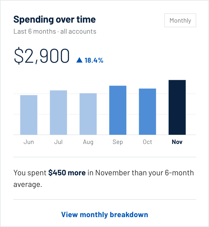
A · Monthly bars, comparison below
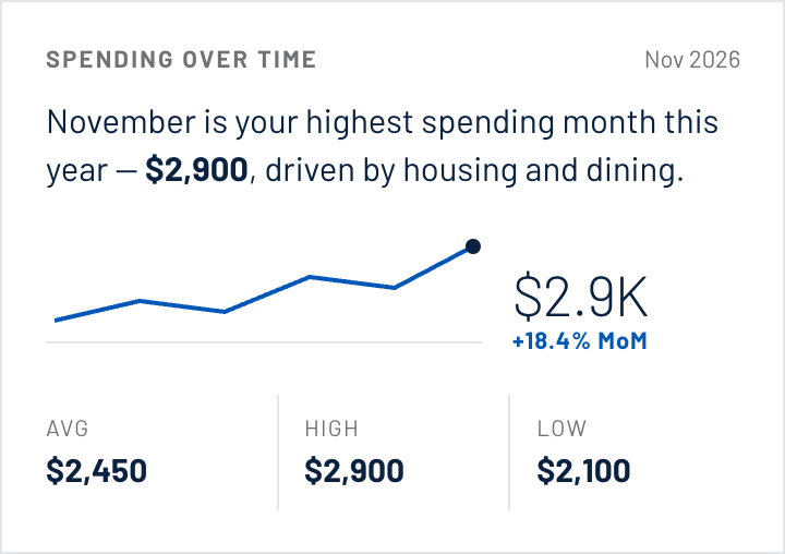
B · Sentence first, dense stats
Exploration 02 · Balance over time
Trend vs. volatility
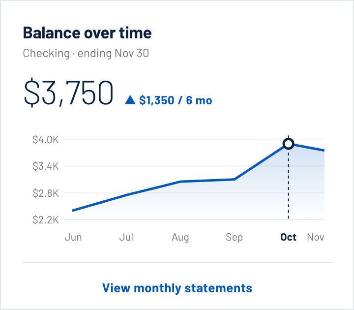
A · Six-month trend, labelled axis
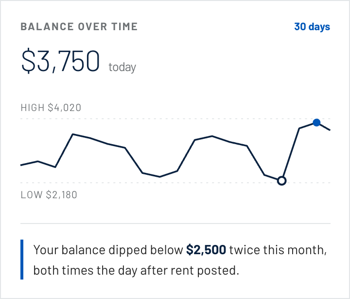
B · 30-day range, dips explained
B won both rounds. Participants could restate the insight without reading the chart, and the chart then confirmed what they had already understood.
The shipped set
Every card answers one question.
One title, one number, one comparison, one action. The chart is evidence for the sentence, never a substitute for it. Cards share a single grid, so any of them can appear in any of the three tabs.
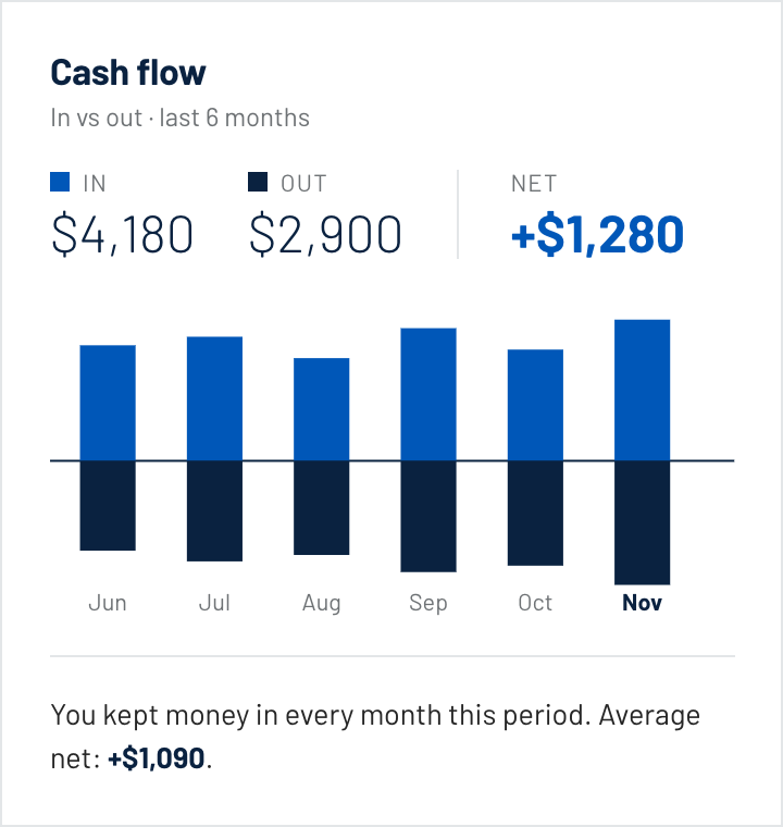
Spending · In vs. out
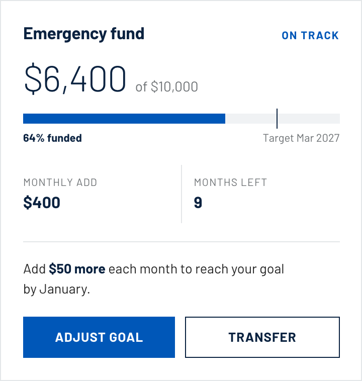
Goals · Goal progress
Card anatomy
One rule, applied everywhere
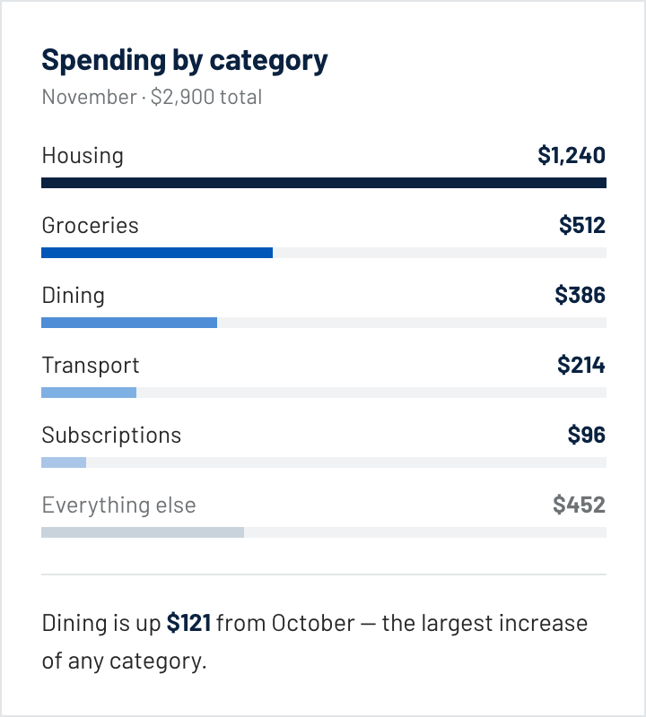
Title, scope, total. Then the ranked evidence, weighted so the largest line reads first. Then one sentence naming the thing a member would otherwise have to work out themselves.
The sentence is the product. Everything above it is the reason to believe it. No card ships without one.
Testing
What testing changed.
Every number needed a baseline
A figure on its own read as a verdict and triggered anxiety. Every number had to carry a comparison — against last month, or against the member’s own six-month average — or it came off the card.
Recommendations needed a reason
Participants distrusted advice from a bank that didn't show its work. Adding a plain-language "why this" line moved trust ratings more than any visual change.
Onboarding had to be shorter
The first pass asked eleven questions before showing anything. Cutting to four, and inferring the rest from held accounts, ended the drop-off.
Outcomes
Measured after launch.
91%
Task success on the core planning flow in final validation.
12→1
Standalone tool destinations consolidated into a single hub.
4
Onboarding questions, down from eleven.
Adoption and engagement figures are held internally. Available on request in interview.
Reflection
The hardest work was not the interface. It was getting four business owners to accept a ranking they did not control — recommendations ordered by member impact rather than by product priority.
If I ran it again I would instrument the cards from day one. We could prove comprehension in the lab, but it took two releases to see which cards actually changed behaviour.
Next case study 02
Merchant Logos