Case study 02 · USAA Bank
Merchant Logos
A raw transaction descriptor is not a memory. A scalable logo-matching system made statements legible at a glance — 52% faster recognition.
Role
Design lead — system definition, visual rules
Timeline
4 months to first release
Team
Designer, data science partner, PM, 4 engineers
Surface
Transaction lists, native app and web
The problem
"What is SQ *PGH 4417?"
Card networks pass through descriptors written for settlement, not for people: processor prefixes, store numbers, truncated legal entities. Members scanning a statement could not match a line to a purchase they clearly remembered making.
The cost showed up downstream — "unrecognized charge" calls, and disputes filed against transactions the member had in fact authorized.
Fallback explorations
What shows when no mark exists
Most merchants will never have a mark. The unmatched row sets the ceiling on how good the list can look, so it was designed first — three treatments, tested against the same statement.
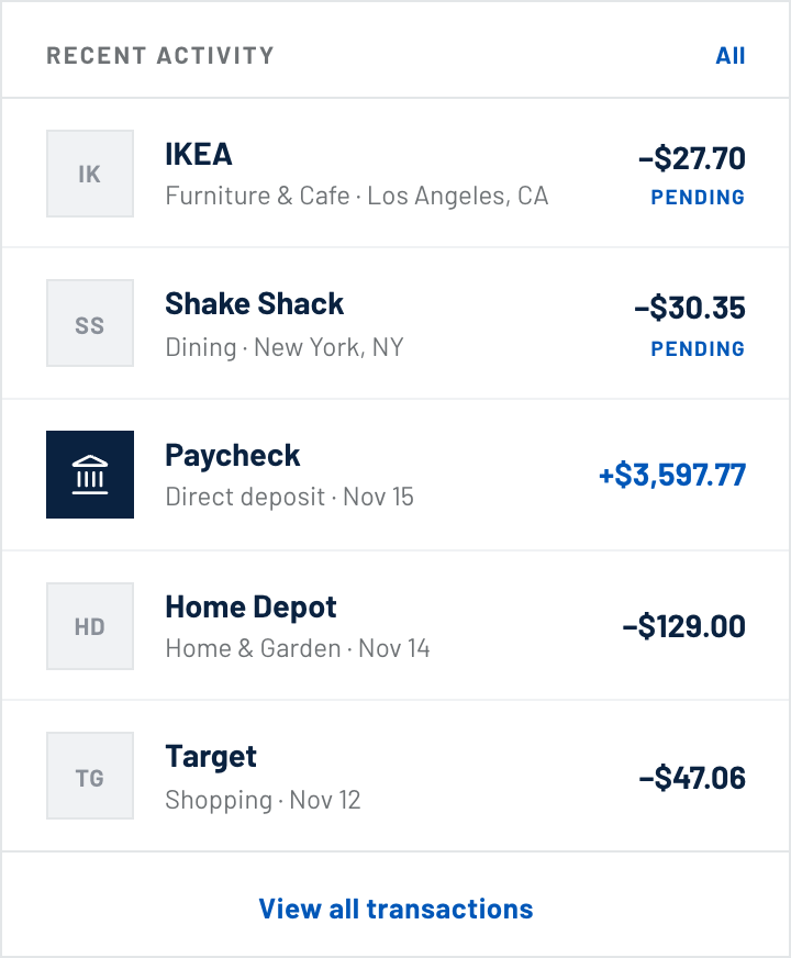
A · Filled tile, two letters
Holds the grid, but a gray slab beside a real mark reads as a broken image.
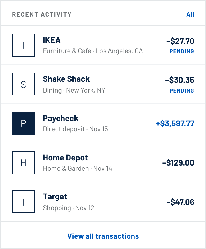
B · Outlined monogram — shipped
Occupies the same square without imitating a logo. Reads as a placeholder on purpose.
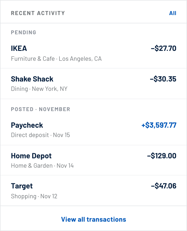
C · No avatar column
Cleanest in isolation. Fails the moment one row in the list does have a mark.
Approach
A system, not a logo library.
Hand-curating marks does not survive contact with millions of merchants. The design problem was really a confidence problem: what to show when the match is certain, likely, or unknown — and how to degrade gracefully without ever lying to the member.
Confidence tiers
High confidence shows the merchant mark and cleaned name. Medium keeps the cleaned name and swaps the mark for an outlined monogram. Low leaves the raw descriptor untouched.
A deliberate fallback
Unmatched rows get an outlined monogram in the same square, so the list keeps its rhythm instead of collapsing into ragged text.
Normalized marks
Every logo is placed on a uniform tile with defined optical padding and a hairline for light marks. Brand colours vary; the geometry never does.
Confidence in practice
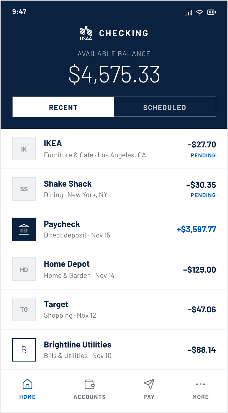
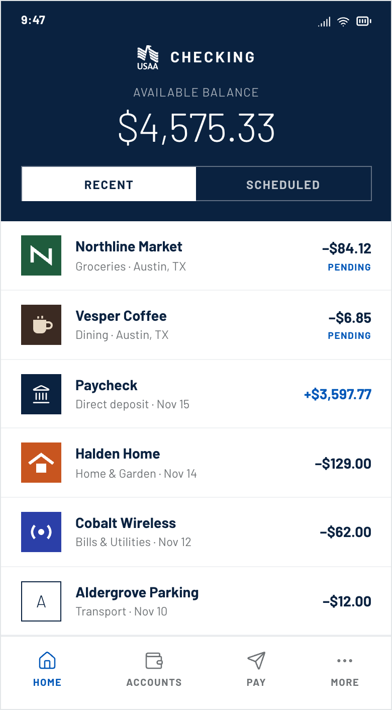
The same list rendered at two ends of the match table. Note the geometry: every mark and monogram occupies an identical square, so a row's height never changes with the quality of the data behind it.
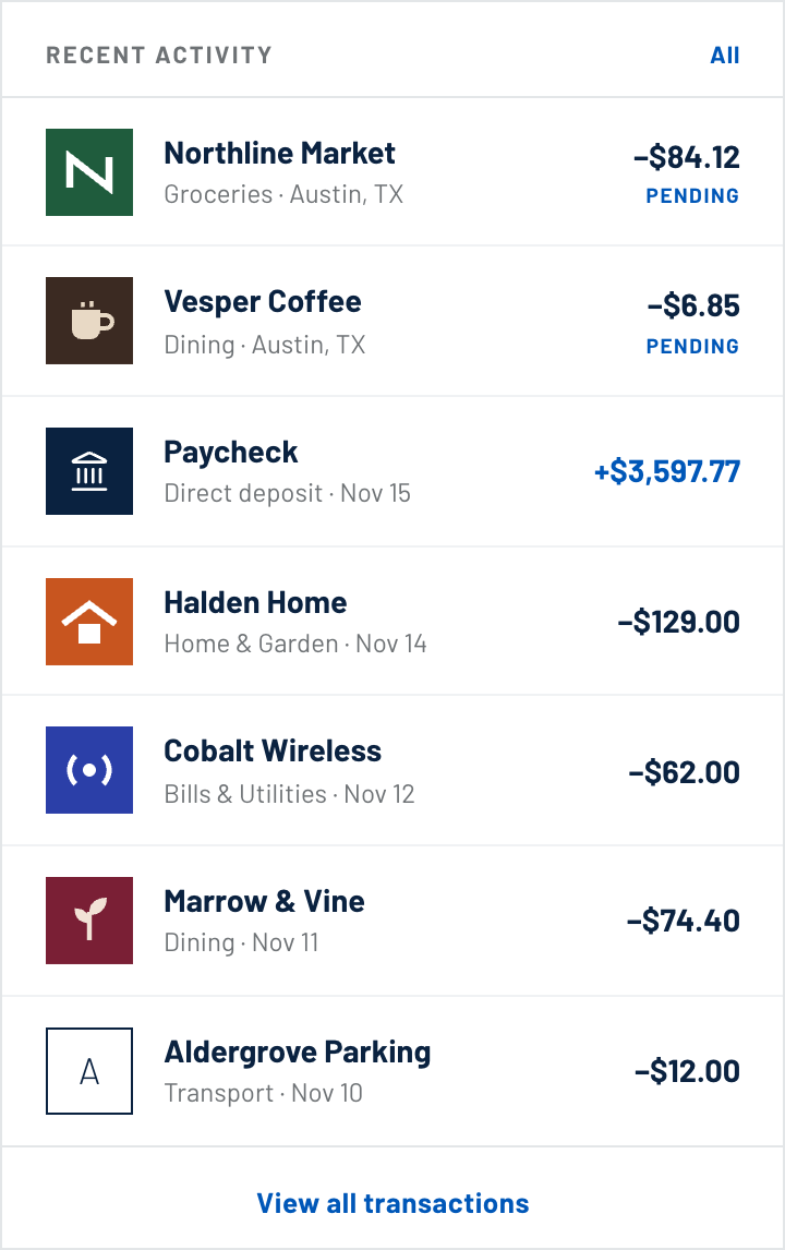
High confidence
Mark, cleaned name, category and location. The descriptor never appears — it has nothing left to explain.
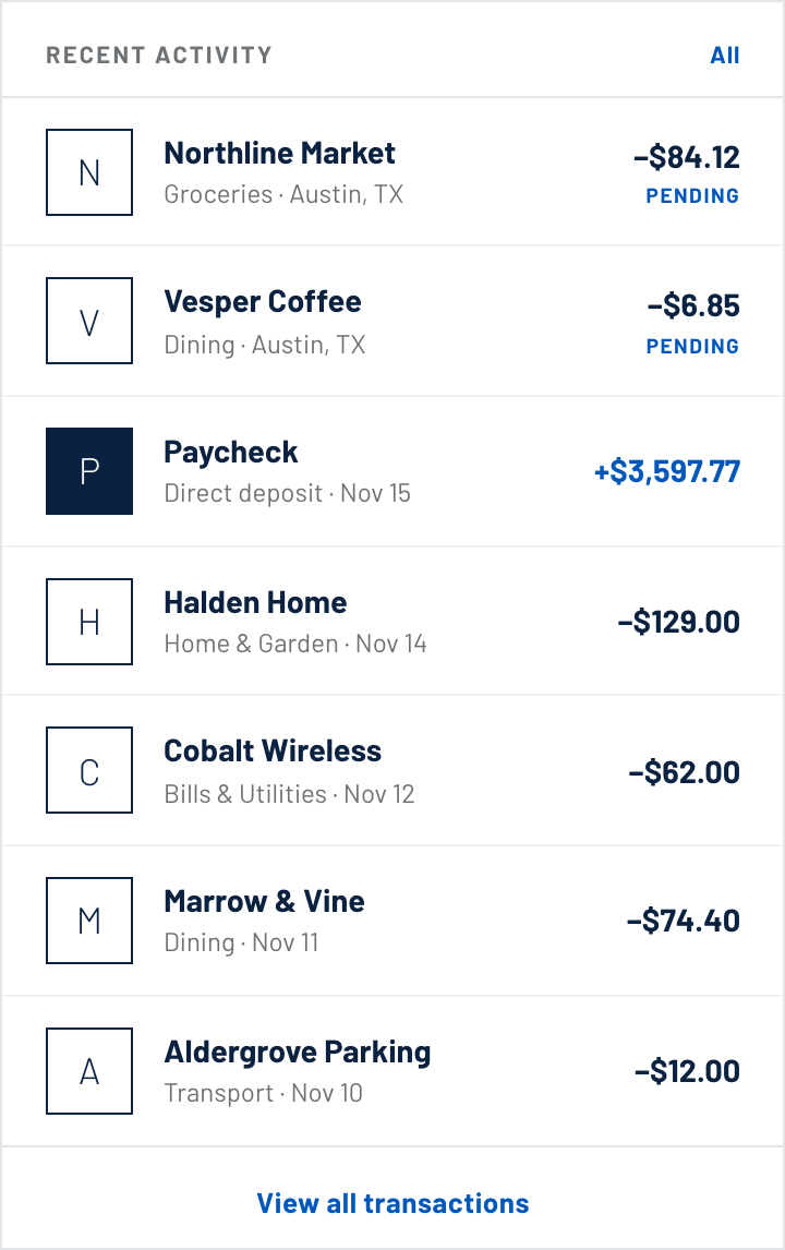
Marks unavailable
Asset missing or match below threshold. The name is still cleaned; only the mark withdraws.
Testing
Timed recognition.
Participants were shown statements built from their own spending patterns and asked to find a specific purchase. We measured time to locate, and errors, against the current production list.
The wrong-logo case mattered most. A confident but incorrect match damaged trust more than no logo at all, which is why the medium tier deliberately withholds the mark.
Outcomes
Legible at a glance.
52%
Faster transaction recognition in timed testing.
3
Confidence tiers, so the system never overstates a match.
1
Shared tile component now reused across every transaction surface.
Reflection
This looked like a decoration request and turned out to be a data-quality project with a visual output. The most useful thing design contributed was the vocabulary for uncertainty — once the team could talk about tiers, the matching threshold became a product decision instead of an engineering default.
Next case study 03
Accident Reporting